Hope Community Inc
Creating connections that strengthen the power of communities.
Client: Hope Community Inc (Hope, Hope Community) is a long-established nonprofit located in the Phillips neighborhood of Minneapolis that started as a shelter and hospitality house in the 1970s. It grew to address the looming gentrification that the neighborhood was facing in the 1990s, and today consists of numerous programs that serve the community.
Role: UX Researcher, Test Moderator, UX Designer, Team Member
Methods: Heuristic Analysis, Moderated Usability Testing, Raw Data Collection, Team Collaboration, Synthesis, Low-Fidelity Wireframing, User Flow, Findings & Recommendations.
Tools: Figma, Zoom, InDesign, Keynote.
The Problem
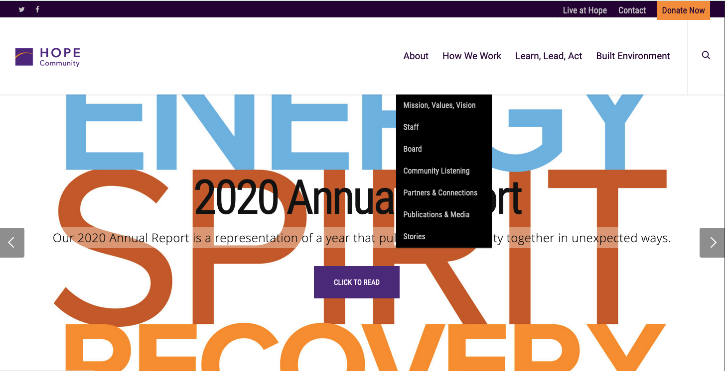
Hope Community Inc is interested in better leveraging their website to meet the needs of their audiences, communicating the wide reach and tremendous impact of their programs to the community, potential volunteers, and donors.
Research will help Hope gain a deeper understanding of the website’s current state, identifying where and how it could be improved in order to more effectively reach its intended goals.
How is Hope Community’s website currently serving their community members, potential volunteers, and donors? What improvements can be made to to create a better understanding of Hope’s values and widen the scope of their impact?
The Goals
Hope Community’s website goals:
Communicate Hope’s goals, mission, and values.
Provide information on how to participate in Hope programming.
Appeal to donors by communicating the work efforts and resulting impact.
The Research
Research began by conducting an individual heuristic analysis of Hope’s website to better understand its effectiveness and identify pain points around the site.
This analysis found Hope Community’s website both demonstrated and violated usability heuristics.
Hope’s mission and values are easy to find, and easily understood. Tasks like searching for community programs and finding housing solutions are hard to navigate.
As a team, we shared and discussed our individual heuristic findings. The results of this collaboration allowed us to create a usability test script that guided our next round of research: moderated usability testing. Testing Hope’s website with community members, potential volunteers, and potential donors helped shed light on the site’s current successes and high-priority pain points.
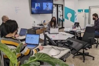
Our team conducted 11 usability tests total, 3 of which I moderated.
Testing was held remotely over Zoom, each test lasting 30minutes.
Participants were asked to walk though a series of scenarios, which provided insights into existing areas of success in meeting Hope’s website goals, as well as opportunities for improvement.
The Synthesis
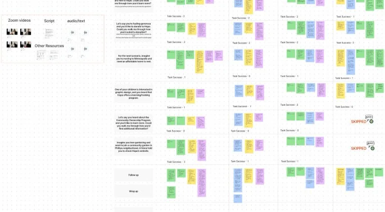
Our team used Figma to compile raw data collected while testing. We grouped information by participant and task in order to discover key themes and to identify and prioritize common pain points. We used this data to create individual findings and recommendations reports.
The Findings
Through usability testing and synthesis I discovered a few key areas of success and a few key opportunities for improvement.
Key Successes:
11/11 Participants clicked on, and expressed their enjoyment scrolling through Hope’s Mission, Vision and Values.
All participants had positive reactions to the website’s photography, branding, or colors.
After a minute of browsing, most participants had a good understanding of Hope’s mission, vision and values.
“I’m on nonprofit websites all of the time - this is some of the best photography and branding I’ve seen... They really tried to represent who they serve.”
Opportunities for Improvement:
11/11 Participants expressed their frustration or confusion while trying to find housing and program information.
0/11 participants were able to successfully search and apply for housing due to broken links.
All participants expressed confusion or frustration while searching for program information.
“I’m not seeing anything about housing listings. I’m a little confused...”
The Recommendations
Recommendations were based off research findings as they related to Hope’s website goals and categorized by priority. Recommendations included: simplifying navigation to improve ease of finding information, fixing broken links to minimize user frustration, and using plain language to maximize user reach.
The highest-priority pain point was found when searching for housing on Hope’s site.
Highest-Priority Recommendation: Create one “Details” page per offered housing option that contains detailed information about each building (i.e. how to apply for housing, rental cost, or where to apply to find rental cost, building location, bedrooms available, building amenities, transportation options, etc). Link this ‘Details’ page to their housing partner’s website for user to click when it’s time to take the next step toward applying.
Example of visualized recommendations through user flow and wire-framing: